⛄️ Last Orders Friday Dec 20th at 12noon. We will be closed Monday Dec 23rd - Re-open Thursday Jan 2nd 2025 🎅
⛄️ Last Orders Friday Dec 20th at 12noon. We will be closed Monday Dec 23rd - Re-open Thursday Jan 2nd 2025 🎅
FREE DELIVERY on everything
FREE DELIVERY on everything
MENU
- New Item
- A3 Leaflets
- A4 Leaflets
- A5 Leaflets
- A6 Leaflets
- A7 Leaflets
- DL Leaflets
- A3 Half Folded
- A4 Half Folded
- A5 Half Folded
- A4 Trifold
- All Strut Cards
- Funeral Order of Service
- Funeral Memory Boards
- Funeral Announcement Cards
- Funeral Thank You Cards
- Order Of Service
- A4 Brochures
- A5 Brochures
- A6 Brochures
- 210 mm Square Brochures
- 148mm Square Brochures
- All Perfect Bound Brochures
- All Wire Bound Booklets
- Gloss Laminated A6 Postcards
- Non Laminated A6 Postcards
- Matt Laminated
- Gloss Laminated
- Velvet Laminated
- Non Laminated
- Spot UV
- Uncoated
- Uncoated Loyalty Cards
- A4 Letterheads
- Compliment Slips
- A4 Presentation Folders
- A5 Presentation Folders
- A5 Christmas Cards
- A6 Christmas Cards
- 148mm Square Christmas Cards
- A0 Poster Printing
- A1 Poster Printing
- A2 Poster Printing
- A3 Poster Printing
- A4 Poster Printing
- All Mounted Posters
- All Roller Banners
- Vinyl Floor Stickers
- A Size Stickers
- Round Stickers
- A3 Leaflets
- A4 Leaflets
- A5 Leaflets
- A6 Leaflets
- A7 Leaflets
- DL Leaflets
- A3 Half Folded Leaflets
- A4 Half Folded Leaflets
- A5 Half Folded Leaflets
- A4 Tri Fold
- Order of Service
- A4 Stapled Brochures
- A5 Stapled Brochures
- A6 Stapled Brochures
- 210mm Square Stapled Brochures
- 148mm Square Stapled Brochures
- A4 Perfect Bound Brochures
- A5 Perfect Bound Brochures
- A6 Perfect Bound Brochures
- 210mm Square Perfect Bound Brochures
- 148mm Square Perfect Bound Brochures
- A4 Wire Bound Brochures
- A5 Wire Bound Brochures
- A6 Wire Bound Brochures
- 210mm Square Wire Bound Brochures
- 148mm Square Wire Bound Brochures
- Matt Laminated
- Gloss Laminated
- Velvet Laminated
- Non-Laminated
- Spot UV
- Uncoated
- Uncoated Loyalty Cards
- A4 Letterheads
- Compliment Slips
- Funeral Order of Service
- Funeral Memory Boards
- Funeral Announcement Cards
- Funeral Thank you Cards
- A0 Poster Printing
- A1 Poster Printing
- A2 Poster Printing
- A3 Poster Printing
- A4 Poster Printing
- A1 Mounted Poster
- A2 Mounted Poster
- A3 Mounted Poster
- A4 Mounted Poster
- MENU
-
All Products
-
- Leaflets / Flyers
- A3 Leaflets
- A4 Leaflets
- A5 Leaflets
- A6 Leaflets
- A7 Leaflets
- DL Leaflets
- Folded Leaflets
- A3 Half Folded
- A4 Half Folded
- A5 Half Folded
- A4 Trifold
- Strut Cards
- All Strut Cards
- Funeral Printing
- Funeral Order of Service
- Funeral Memory Boards
- Funeral Announcement Cards
- Funeral Thank You Cards
- Brochures / Booklets
- Order Of Service
- Stapled Brochures
- A4 Brochures
- A5 Brochures
- A6 Brochures
- 210 mm Square Brochures
- 148mm Square Brochures
- Perfect Bound Brochures
- All Perfect Bound Brochures
- Wire Bound Booklets
- All Wire Bound Booklets
- Postcard Printing
- Gloss Laminated A6 Postcards
- Non Laminated A6 Postcards
- Business Cards
- Matt Laminated
- Gloss Laminated
- Velvet Laminated
- Non Laminated
- Spot UV
- Uncoated
- Uncoated Loyalty Cards
- Business Stationery
- A4 Letterheads
- Compliment Slips
- Presentation Folders
- A4 Presentation Folders
- A5 Presentation Folders
- Christmas Cards
- A5 Christmas Cards
- A6 Christmas Cards
- 148mm Square Christmas Cards
-
-
Leaflets / Flyers
-
Brochures / Booklets
-
- Brochure / Booklets
- Order of Service
- Stapled Booklets
- A4 Stapled Brochures
- A5 Stapled Brochures
- A6 Stapled Brochures
- 210mm Square Stapled Brochures
- 148mm Square Stapled Brochures
- Perfect Bound Brochures
- A4 Perfect Bound Brochures
- A5 Perfect Bound Brochures
- A6 Perfect Bound Brochures
- 210mm Square Perfect Bound Brochures
- 148mm Square Perfect Bound Brochures
- Wire Bound Brochures
- A4 Wire Bound Brochures
- A5 Wire Bound Brochures
- A6 Wire Bound Brochures
- 210mm Square Wire Bound Brochures
- 148mm Square Wire Bound Brochures
-
-
Business Stationery
-
Funeral Printing
-
Poster Printing
| hello@print-print.co.uk 01952 850 730 |
- MENU
-
All Products
-
- Leaflets / Flyers
- A3 Leaflets
- A4 Leaflets
- A5 Leaflets
- A6 Leaflets
- A7 Leaflets
- DL Leaflets
- Folded Leaflets
- A3 Half Folded
- A4 Half Folded
- A5 Half Folded
- A4 Trifold
- Strut Cards
- All Strut Cards
- Funeral Printing
- Funeral Order of Service
- Funeral Memory Boards
- Funeral Announcement Cards
- Funeral Thank You Cards
- Brochures / Booklets
- Order Of Service
- Stapled Brochures
- A4 Brochures
- A5 Brochures
- A6 Brochures
- 210 mm Square Brochures
- 148mm Square Brochures
- Perfect Bound Brochures
- All Perfect Bound Brochures
- Wire Bound Booklets
- All Wire Bound Booklets
- Postcard Printing
- Gloss Laminated A6 Postcards
- Non Laminated A6 Postcards
- Business Cards
- Matt Laminated
- Gloss Laminated
- Velvet Laminated
- Non Laminated
- Spot UV
- Uncoated
- Uncoated Loyalty Cards
- Business Stationery
- A4 Letterheads
- Compliment Slips
- Presentation Folders
- A4 Presentation Folders
- A5 Presentation Folders
- Christmas Cards
- A5 Christmas Cards
- A6 Christmas Cards
- 148mm Square Christmas Cards
-
-
Leaflets / Flyers
-
Brochures / Booklets
-
- Brochure / Booklets
- Order of Service
- Stapled Booklets
- A4 Stapled Brochures
- A5 Stapled Brochures
- A6 Stapled Brochures
- 210mm Square Stapled Brochures
- 148mm Square Stapled Brochures
- Perfect Bound Brochures
- A4 Perfect Bound Brochures
- A5 Perfect Bound Brochures
- A6 Perfect Bound Brochures
- 210mm Square Perfect Bound Brochures
- 148mm Square Perfect Bound Brochures
- Wire Bound Brochures
- A4 Wire Bound Brochures
- A5 Wire Bound Brochures
- A6 Wire Bound Brochures
- 210mm Square Wire Bound Brochures
- 148mm Square Wire Bound Brochures
-
-
Business Stationery
-
Funeral Printing
-
Poster Printing


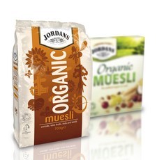
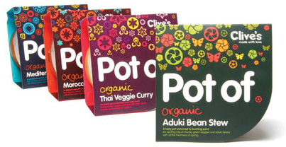
 But not all healthy companies go for dul pastels or earthy colours, checkout this ‘POT OF’ pakaging, this shows how colourts taken fomr the same side of hte spectrum as the organic set, an easily be used in a vibrat and eye-catching manor.
